State of the climate – a 2013 snapshot

NASA measurements
2013 Temperature Anomaly

In January, NASA and NOAA (the US National Oceanic and Atmospheric Administration) released a joint statement on the temperature and climate patterns seen in 2013. Their short presentation (PDF) gives a summary of last year’s data in relation to long-term trends and averages. Of particular note for Arctic scientists is the relatively cool high-latitude temperatures in mid-summer. These lead to less summer sea-ice melting compared to the previous year’s record-breaking minimum, causing nonsensical headlines from the usual suspects that the world was cooling down. As slides 2,3 and 8 show, 2013 was one of the warmest years on record, while slide 11 shows that Arctic sea ice was still far below average last year.

Polar ice cover graphs
Polar ice cover through time

Public perceptions

A new report from Yale has found that “belief” in climate change among the American public is decreasing, and that now less than half of people believe that climate change is man-made.

So why is this? My personal guess is that we’ve all got a little bit of David Cameron inside us, and when things got tough we decided to “cut the green crap”. Shrinking fincances have led to a more selfish outlook, we just can’t justify spending more on sustainable energy when there are other, more basic, needs to consider. Couple this with a natural desire to believe that whatever bad things happen are not our personal fault, and an increasingly vocal climate skeptic lobby, and it’s understandable that people would want to switch sides.

But wait, burying our heads in the sand is not the answer. Things have changed recently, measurements have been taken and trends have been spotted that, with the right spin on them, would appear to play right into the hands of the global warming deniers, yet the reality is that we should be as concerned as ever about the future of our planet. Recently I have spoken to several well-educated, some extremely well-educated, people who, despite all the coverage are unconvinced that we, you me and 7 billion other human beings, are responsible for the changing climate, or even that it is changing at all. This seems to be a new thing, a few years ago they might have been on the other side of the debate. Has climate skepticism become fashionable?

I’m not about to start presenting all the data and rebuking every argument about climate change, the volume of data is too large and there are so many points to argue about that I don’t have the time. However, lots of other people do have the time:

The latest IPCC report is probably a good start if you want the “official” summary:

http://www.climatechange2013.org/images/uploads/WGI_AR5_SPM_brochure.pdf

A more targeted and less hardcore site goes through the climate skeptic arguments one by one:

http://www.skepticalscience.com/

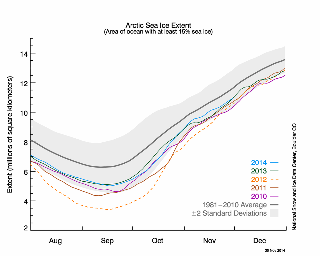
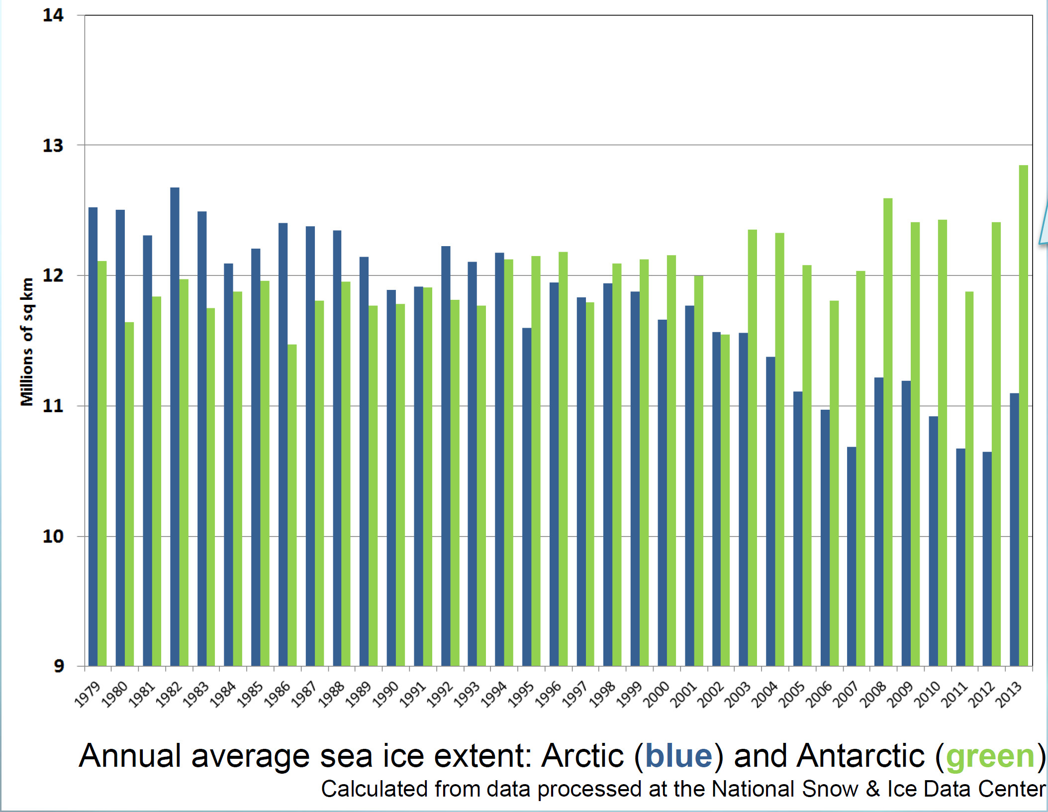
And now for my two-pence worth. It’s mostly an appeal for common sense, from both sides of the argument. Journalists are always keen to get a good story, and people with opinions are always keen to emphasise evidence that they are right. However, our planet is a complex system and a single piece of evidence does not sway things. 2012 was a record-breaking year for ice cap retreat in the Arctic, the summer ice coverage was the lowest ever. This led to a lot of reporting which, justifiably, picked up on this and suggested that it might be a bad thing. But did they go too far? Was one data point enough to justify widespread panic? Probably not, but it was something to bear in mind and consider along with all the other available evidence. Subsequently, since we are not yet in a run-away global warming apocalypse, when 2013 failed to break the record again and was merely in line with other data from the 2000s, the journalists on the other side of the argument got to crow that the world was cooling down again. Now they’re almost certainly wrong in every degree – a quick look at longer-term trends would show that 2013 was still far lower than the average and that ice thickness is reducing quickly – but both scientists and science journalists must beware of crying wolf based on a single year’s data.

Getting people worried about climate change was a good thing, but doomsday prophesies about massive immediate changes that have not been borne out will only lead to disbelief.  Just like the size of the ice cap, public belief in global warming is probably due to a number of nebulous factors and might fluctuate from year to year and we as a scientific community must be sensible about the way in which our concern is projected in the media, concentrating on boring but incontrovertible long-term trends rather than sexy but one-off events. As ever, climate != weather.

IMOG 2 Deepwater Horizon

Today’s news comes from a talk by Dave Hollander about the 2010 Deepwater Horizon oil spill.
Did you know that only 25% of the oil made it to the sea surface? The extremely high pressure, generated by the oil being 18km below the sea floor, caused the ejected oil to form microscopic particles too small to float to the surface. Instead, a plume of toxic oil formed at 1000m water depth and drifted along the continental margin. This “toxic bathtub ring” killed all seafloor organisms for thousands of square km.
To compound this, oil at the surface was broken up using dispersant and flushed back out to sea by increasing the flow of the Mississippi River. Once out at sea, algae bound the oil droplets together, causing them to sink down as a “flocculant dirty blizzard”. While these processes avoided the politically sensitive issue of oil covering the shoreline and killing large numbers of birds and mammals, the disaster has been moved to the deep sea, where it’s harder to see but also harder to fix, and the effects are still working their way through the system. Fish caught today in the Gulf of Mexico are showing symptoms of lethal oil ingestion, and it could take years for the ecosystem to recover.

IMOG 26, Tenerife(!)

This week I am at the 26th IMOG conference, which is taking place in the cold, wet setting of Tenerife. IMOG, the International Meeting on Organic Geochemistry, is a medium sized conference devoted to both academic biogeosciences, especially molecular studies, and also cutting edge research from the oil industry.
Fact of the day: speleothems (stalactites and stalagmites) contain less than 0.01% organic carbon – they are mostly calcium carbonate of course – but you can dissolve away the minerals and inject this tiny fraction directly into an LCMS in order to measure specific organic molecules, and even calculate their carbon isotope composition!

Automated Analysis of Carbon in Powdered Geological and Environmental Samples by Raman Spectroscopy

The first paper produced directly from my PhD research was published last month in the journal Applied Spectroscopy. Automated Analysis of Carbon in Powdered Geological and Environmental Samples by Raman Spectroscopy describes a method I developed for collecting and analysing Raman Spectroscopy data, along with Niels Hovius, Albert Galy, Vasant Kumar and James Liu.

I will discuss Raman Spectroscopy in depth in a future post on this site, but the short version is that Raman allows me to determine the crystal structure of pieces of carbon within my samples. A river or marine sediment sample can be sourced from multiple areas, and mixed together during transport. Trying to work out where a sample was sourced from can prove very difficult. However, these source areas often contain carbon of different crystalline states; if I can identify the carbon particles within a sample then the sources of that sample, even if they have been mixed together, can be worked out. The challenge in this procedure is that there can be lots of carbon particles within a sample, and each one might be subtly different. To properly identify each mixed sample, lots of data is required, which can laborious to process.

Each spectrum is classified according to its peak shapes.
Determining the types of carbon in a sample. Each spectrum is classified according to its peak shapes. Image (C) Applied Spectroscopy

My paper describes how lots of spectra can be collected efficiently from a powdered sediment sample. By flattening the powder between glass slides and scanning the sample methodically under the microscope, around ten high-quality spectra can be collected in an hour, meaning five to ten samples can be analysed in a day. Powdered samples are much easier to study than raw, unground, sediment, and I have shown that the grinding process does not interfere with the structure of the carbon particles, therefore it is a valid processing technique.

Once the data has been collected, I have devised a method for automatically processing the collected spectrum using a computer, which removes the time-consuming task of identifying and measuring each peak by hand. The peaks that carbon particles produce when analysed by Raman Spectroscopy have been calibrated by other workers to the maximum temperature that the rock experienced, and this allows me to classify each carbon particle into different groupings. These can then be used to compare various samples, characterise the source material and then spot it in the mixed samples.

Delegating as much analysis as possible to a computer ensures that each sample is treated the same, with no bias on the part of the operator, and also cuts down the time required to process each sample, which means that more material can be studied. The computer script used to analyse the samples is freely available and therefore other researchers can apply this to their data, enabling a direct comparison with any samples that I have worked on. This technique will hopefully prove useful to more than just my work in the future, and anyone interested in using it is welcome to contact me. While the paper discusses my application of the technique to Taiwanese sediments, I have already been using it to study Arctic Ocean material as well.

The paper itself is available from the journal via a subscription, and is also deposited along with the computer script in the University of Manchester’s open access library.


Dr Heath-Robinson

Testing in progress
Testing in progress

Sometimes science involves £1 million machinery, exciting state-of-the-art laboratories, expensive and/or explosive chemicals, travel to far-flung exotic lands and schmoozing over canapes. Sometimes it involves retrieving some bits and bobs from a series of dusty drawers and bodging them together into something approximating workable equipment. Today was one of those days. I’ll explain Pyrolysis in a later post, but the aim of today’s work was to create an offline-pyrolysis set-up that can be used to prepare large quantities of sample for analysis later on. The pyrolysis oven itself was already in place, but a regular flow of nitrogen gas is needed to blow through it and transport the chemicals that are released.

Delving around in the back of the lab, we managed to find the inner workings of an old carbon analysis machine sitting in pieces in a drawer. There were flow regulators; lots of copper pipes; a series of connecting nuts and bolts, of which most were incompatible with each other, but some that would play nicely; a couple of glass tubes filled with unknown solids; a pressure sensor; and a piece of steel that once lived inside the machine.

Testing in progress
How it all works

And here we have it! Gas comes from the bottle in the background into the first flow regulator. In an attempt at clarity and sensibility, this is the one on the right hand side, with the “H” dial on, since that’s the only way that the pipework at the back would work properly. At this point the input pressure from the bottle is measured as well, which will hopefully correspond nicely to the pressure measured from the regulator. This first regulator is more of a glorified tap, able to determine roughly how much gas comes through the system but not to accurately control the output rate.

Once the gas has flowed through here, the second flow regulator (on the left) has a much more precise knob (just out of shot above the word “PORTER”) that determines how much gas can flow through the rest of the system. This regulator also has a little floating ball gauge to show the flow rate.

After that, the gas is cleaned in the u-bend. This will remove any liquid from the gas, so that it is nice and dry when it passes onto the samples, hopefully preventing them from reacting with the gas at all.

The last item on this test rig, is the output testing device. A glass of water.

Success! A nice steady flow of bubbles emerging from the system


Just how much permafrost is there?

The extent and type of Russian permafrost

Permafrost covers 24% of the Earth’s northern hemisphere land surface, but how much is that? Well 24% corresponds to 23,000,000 km2. That is a pretty big number, and doesn’t even count the subsea permafrost that covers lots of the Arctic Shelf (see the map above) so here are a few comparisons and measurements in less standard units.

Great Britain compared to the Russian permafrost area.

Firstly, let’s compare the permafrost area to some other countries and continents. Here is Britain in comparison, at 243,000 km2 it is almost inconsequential. Only one tenth of the northern hemisphere permafrost. Going up the scale Australia, with an area of 7,700,000 km2, is one third of the northern hemisphere permafrost, and roughly the same size as the 7,400,000 km2 that continuous and discontinuous permafrost represent in Siberia alone.

The land area of Australia compared to the Siberian permafrost

The maps above use data from the National Snow and Ice Data Centre

PDF versions are also available. Map1, Map2, Map3.

The World according to Siberia

When displaying data near the poles, the choice of map projection is very important. Displaying a 3D object in a 2D screen is always problematic, and involves compromises in either accuracy, practicality or legibility. The standard Mercator projection, as used in the majority of maps seen on a day-to-day basis, stretches the polar regions to infinity. Greenland looks enormous on this map, yet it is actually just smaller than the Democratic Republic of the Congo, and only one quarter of the area of Brazil. To get around this problem, other map projections are available.

Siberan-centred map
LAEA projection centred on Siberia – click to enlarge

The projection I have chosen to use for maps of the Siberian permafrost is the Lambert Azimuthal Equal Area map. This projection adjusts shapes and distances in order to preserve the true area of each country. If you look at the full-size version of the map above (click it, or download here) then the view of the Arctic region is relatively consistent with the true layout as viewed from above, but there is an increasing amount of distortion as the distance from Siberia increases.

Look out for this projection in future posts!

When it all goes haywire

Sometimes it all seems to go wrong at once – yesterday we needed to replace a gas regulator, replace a broken filament in the Mass Spectrometer, clean several months of dirt from the filament housing, and pump all the air out of the system to make a vacuum again.

The filament in action

The important thing when setting everything up again is to run a standard. This will check that the machine is functioning properly before there is a risk of wasting precious samples in faulty equipment. A standard sample will be simple enough to produce a consistent result, but complex enough to produce more than just one peak in the chromatogram.

Preparing a standard - slice a small piece of PE and insert into a glass tube
Preparing a standard – slice a small piece of PE and insert into a glass tube

We use poly-ethylene  as a pyrolysis standard because the long polymer chains will break into a range of sizes during the heating phase. This produces a nice series of identical peaks, which emerge from the column in the order of their chain length. As long as this run comes out clean, it’s good to go.

A Poly-ethylene Py-GC chromatogram

Perfect – now the GC is up and running again

What Is: Gas Chromatography (GC)?

Gas Chromatography is the separation of molecules from a mixture using a gaseous carrier medium.

Gas Chromatography allows an organic geochemist to identify and quantify some of the molecules present in a sample. The procedure is similar to Liquid Chromatography (LC), in that a collection of molecules is split into its constituent parts by passing them through a column of material. As the different molecules emerge from the column they are measured by a Flame Ionisation Detector (GC-FID) or identified by a Mass Spectrometer (GC-MS). A GC consists of a sample injector, a column housed within an oven, and an outlet to the detector.

Agilent GC system
Agilent GC system

The sample injector is responsible for putting a precise amount of sample into the column at the start of the sample run. A syringe is washed in solvent to remove any contamination, and then sucks up-and-down in the sample a few times to mix the sample and make sure there is no air in the syringe. Once the oven is ready for injection, the needle pierces the seal on the top of the GC and injects the sample onto the column. The sample is a liquid at this point, but will evaporate quickly and pass through the column as a gas.

GC autosampler
GC autosampler

The column is a 30m coil of glass tubing, just thicker than a hair, which is coated on the inside with an adsorbant material that slows the organic molecules as they pass through. The column is kept inside an oven which is carefully calibrated and can change its temperature during the sample run. In general, smaller, simpler molucules will pass through the column quicker, especially at lower temperature. Molecules will move easier when the temperature is hotter, so the easiest way to separate a mixture of molecules into their constituent parts is to start off at cool temperatures and slowly increase during the run (e.g. 40 to 300 °C over one hour). Simple molecules such as benzene or hexane might pass through the column in 2-3 minutes, whilst large, complex molecules might take up to 45 minutes. The slower the oven temperature increases, the further apart each molecule will be, making it easier to separate each one.

A GC column in the oven

Once the molecules have passed through the column they exit into the detector. This can be a Mass Spectrometer (MS), which identifies the molecule, or a simpler detector that counts the concentration of molecules exiting the column but cannot identify them, such as a Flame Ionisation Detector (FID). Simple detectors, such as the FID, are most useful when the sample is less complex, such as comparing the concentration of a target molecule.