Macromolecular organic matter across the East Siberian Arctic Shelf

Update: The paper is now published and can be downloaded from the journal webpage.

Map of radiocarbon ages across the ESAS

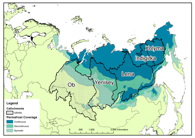
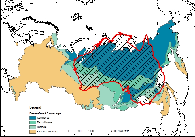
The study continues our work on the East Siberian Arctic Shelf, and contains two new datasets. The first is a radiocarbon study, measuring the age of organic matter on the shelf using carbon dating (see map above). By measuring the age, we can determine whether the carbon has come from the ocean (very young), the topsoil (quite young) or the coastal permafrost (thousands of years old). We combined our results with those already measured on the shelf to form the most complete radiocarbon map for this area. The high-resolution map shows that areas close to the shore and away from the major rivers are home to very old carbon, almost certainly sourced by erosion of old permafrost cliffs. Elsewhere on the shelf, the carbon is younger but not as young as modern topsoils or ocean carbon. Therefore the coastal erosion carbon is having an influence right across the shelf.

A pyrolysis probe can heat samples to 900 C in milliseconds

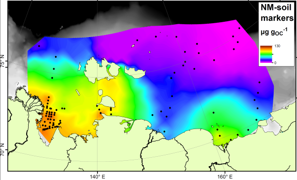
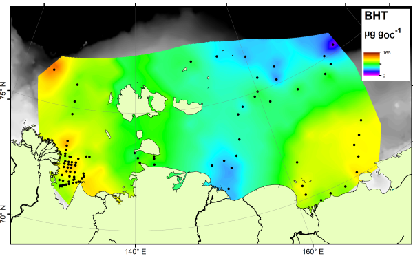
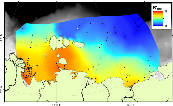
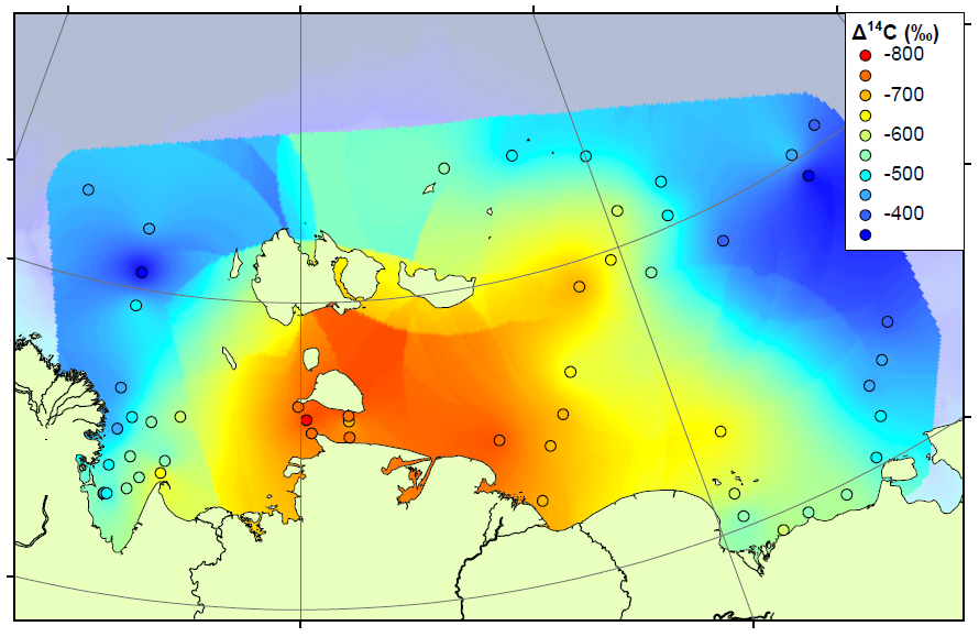
Our second technique is pyrolysis GCMS, where samples are smashed into small pieces using high temperatures and the small pieces are then analysed using GCMS. This technique generates a large amount of small pieces, too many to analyse each one individually, and so we decided to concentrate our efforts on a few target molecules. These included Phenols, which are probably sourced from lignin, a major component of land plants, and Pyridines, which are nitrogen-containing compounds probably sourced from proteins. We think that a lot of the Pyridines in the Arctic Ocean will come from organisms living in the ocean itself, and therefore the Pyridines are a potential tracer for marine organic matter. By comparing the concentrations of Phenols and Pyridines, we can estimate the amount of terrestrial and marine organic carbon in a sample.

Phenol-Pyridine ratio on the Arctic Shelf

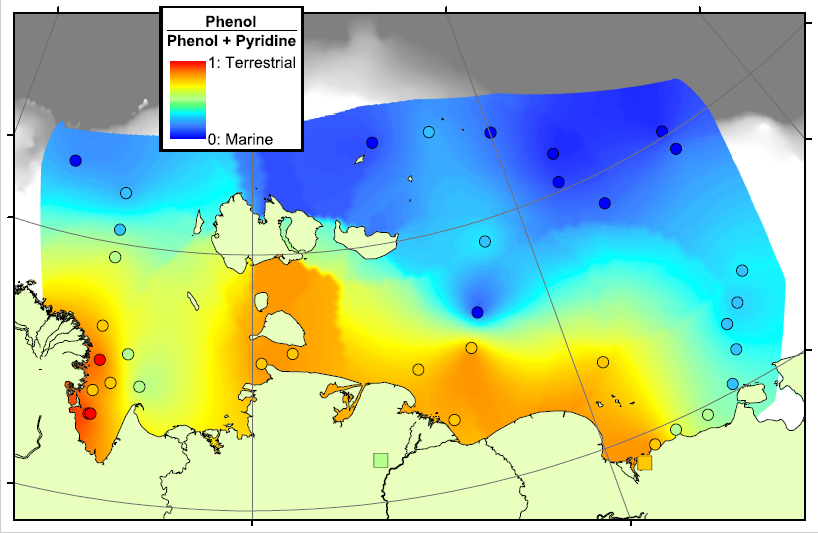
In the map above, red areas are dominated by Phenols and are therefore rich in terrestrial carbon, blue areas are dominated by Pyridines and are therefore rich in marine carbon. This pattern matches very well with our previous work in the region, showing that there is a transition from terrestrial to marine conditions across the Arctic Shelf, and that the transition zone lasts for hundreds of kilometres offshore. This means that there is a lot of terrestrial carbon being deposited, and hopefully buried, on the shelf, rather than all of the eroded carbon being degraded and released as CO2.

The Cryosphere, 10, 2485-2500, 2016
https://doi.org/10.5194/tc-10-2485-2016

Source, transport and fate of soil organic matter inferred from microbial biomarker lipids

06/09/2016 UPDATE: The paper has been accepted and is now published. The final version is available from the journal.

Our international team of East Siberian researchers currently has a paper in open review at Biogeosciences. The discussion paper, and its interactive comments, can be downloaded from the  journal website.

The paper studies a group of compounds called “bacteriohopanepolyols” (BHPs for short), which are found in the cell membranes of a range of microbes and are therefore one of the most common organic compounds around. They are found in modern and ancient sediments from all over the world. This study has concentrated on two groups of these. Group 1 is the soil marker compounds. These are only found in soils, and so have been used as tracers for soil material in rivers, lakes and offshore. Here is how they are spread across the East Siberian Artic Shelf:

BHPfig2a (Custom)
Soil marker compounds across the Arctic Shelf

Note how the soil marker concentrations are highest (orange colours) near to the rivers and coastlines. By measuring the concentration next to the river mouths, and in the sediments being washed away by coastal erosion, we show that it is not just rivers that are delivering the soil markers to the Arctic Ocean.

There is no single compound that is a true tracer for carbon produced in the ocean itself, but the compound bacteriohopanetetrol (BHT) is most abundant in marine settings despite being found in soils as well. Therefore if your sample is rich in BHT, and poor in soil markers, it is likely dominated by carbon from the ocean. Here’s a map of BHT across the East Siberian Arctic Shelf:

BHPfig2b (Custom)
BHT, a marine marker, is present across the Arctic Shelf

The BHT results show a fairly constant amount across the ocean floor. If we compare the soil marker concentrations to the BHT concentrations, we can see which areas are rich in soil carbon (more soil markers than BHT) and which are rich in marine carbon (more BHT than soil markers). This comparison is called the R’soil index, and is shown below:

R'soil index on the Arctic Shelf
R’soil index on the Arctic Shelf

The R’soil index shows that all along the East Siberian Arctic coastline, offshore sediments are dominated by carbon from the land. As you go further offshore, especially in eastern parts nearer to the Pacific Ocean, marine carbon is more important. This result shows a similar pattern to that seen using stable carbon isotopes, but is different to the pattern shown by the BIT index. Therefore these two indices, both based on microbial biomarkers, are tracing different parts of the carbon cycle.

What Is: GRAR?

Russia is big, really big, and to go with that, it has some very big rivers. The majority of the Russian river outflow is into the Arctic Ocean, especially in the central and eastern parts of the country, and this is generally concentrated into a series of very large rivers. The largest of these are known as the Great Russian Arctic Rivers (GRARs). From west to east, these are the Ob, Yenisety, Lena, Indigirka and Kolyma, of which the Ob and Lena are largest, and Indigirka the smallest (small enough to not count in some people’s list of GRARs).

Catchment areas of the Great Russian Arctic Rivers

The Ob river is the world’s fifth-longest and has the sixth-largest drainage basin, yet has only the 19th highest annual discharge, being overtaken by the smaller Yenisey and Lena rivers to the east of it. All of these river basins contain some permafrosted land, which can reduce discharge during the winter months and have a very large flood-period in late spring / early summer when the meltwater arrives (the “freshet”).

Permafrost within catchments of the GRARs

As the amount and continuity of permafrost increases from west to east, so the proportion of each permafrost type increases within the river basin. The Ob and Yenisey are largely free of continuous permafrost, allowing water to flow through the ground to the bedrock and into the river, whilst the Indigirka and Kolyma are practically 100% continuous permafrost, and thus any water discharging will have run along the top of the ground before entering the river itself. This can have consequences for the type of material, especially carbon, carried by the rivers.

Proportion of each type of permafrost within river basins

This east-west contrast is worth exploring in more detail in a later post, since it shows how Siberia may behave very differently if the permafrost were to thaw. As a final reminder of just how large the rivers are, even the smallest, Indigirka, manages to cover more area than the British Isles! As usual the full-resolution PDFs of the figures from this article can be downloaded here: River catchments no permafrost, Catchments and permafrost, Permafrost chart, Catchments and UK.

Comparing the catchment areas to the British Isles


Just how much permafrost is there?

The extent and type of Russian permafrost

Permafrost covers 24% of the Earth’s northern hemisphere land surface, but how much is that? Well 24% corresponds to 23,000,000 km2. That is a pretty big number, and doesn’t even count the subsea permafrost that covers lots of the Arctic Shelf (see the map above) so here are a few comparisons and measurements in less standard units.

Great Britain compared to the Russian permafrost area.

Firstly, let’s compare the permafrost area to some other countries and continents. Here is Britain in comparison, at 243,000 km2 it is almost inconsequential. Only one tenth of the northern hemisphere permafrost. Going up the scale Australia, with an area of 7,700,000 km2, is one third of the northern hemisphere permafrost, and roughly the same size as the 7,400,000 km2 that continuous and discontinuous permafrost represent in Siberia alone.

The land area of Australia compared to the Siberian permafrost

The maps above use data from the National Snow and Ice Data Centre

PDF versions are also available. Map1, Map2, Map3.

The World according to Siberia

When displaying data near the poles, the choice of map projection is very important. Displaying a 3D object in a 2D screen is always problematic, and involves compromises in either accuracy, practicality or legibility. The standard Mercator projection, as used in the majority of maps seen on a day-to-day basis, stretches the polar regions to infinity. Greenland looks enormous on this map, yet it is actually just smaller than the Democratic Republic of the Congo, and only one quarter of the area of Brazil. To get around this problem, other map projections are available.

Siberan-centred map
LAEA projection centred on Siberia – click to enlarge

The projection I have chosen to use for maps of the Siberian permafrost is the Lambert Azimuthal Equal Area map. This projection adjusts shapes and distances in order to preserve the true area of each country. If you look at the full-size version of the map above (click it, or download here) then the view of the Arctic region is relatively consistent with the true layout as viewed from above, but there is an increasing amount of distortion as the distance from Siberia increases.

Look out for this projection in future posts!