When displaying data near the poles, the choice of map projection is very important. Displaying a 3D object in a 2D screen is always problematic, and involves compromises in either accuracy, practicality or legibility. The standard Mercator projection, as used in the majority of maps seen on a day-to-day basis, stretches the polar regions to infinity. Greenland looks enormous on this map, yet it is actually just smaller than the Democratic Republic of the Congo, and only one quarter of the area of Brazil. To get around this problem, other map projections are available.
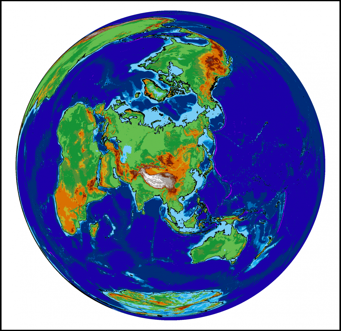
The projection I have chosen to use for maps of the Siberian permafrost is the Lambert Azimuthal Equal Area map. This projection adjusts shapes and distances in order to preserve the true area of each country. If you look at the full-size version of the map above (click it, or download here) then the view of the Arctic region is relatively consistent with the true layout as viewed from above, but there is an increasing amount of distortion as the distance from Siberia increases.
Look out for this projection in future posts!